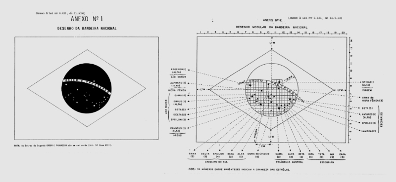
The Brazilian national flag is striking in its contrasts: the colorful, orderly geometry centered against a constellational smattering of stars, the straightforward sans-serif typography against its subtle contoured encasing, suggestive of a sphere.

It’s impossible to escape the elegance of the Brazilian flag. Even Wikipedia’s cut and dried caption takes on the aesthetic quality of a Haiku:
A blue disc depicting a starry sky spanned by a curved band inscribed with the national motto, within a yellow rhombus, on a green field.
The composition of stars immortalizes the night sky as seen from Rio on November 15, 1889, when the flag was first adopted. We think it’s one of the best uses of stars in flag design, with the former USSR coming in at a close second, both of which overshadow the current US flag, with its garish militaristic arrangement.

For a more thorough, technical explanation of the dimensions and assembly of this flag consult the official government style guide.
